Before you start…
Make sure you are still in your project that you created for doing exercises and then make a new R script. Save it as soon as you make it and give it a good name like exercise_1_day_3.R or george.R and you’ll be ready to go!
Palmer Penguin Exploration
Solving problems, making friends
This is our big chance to show the researchers that we can be the best analysis bot ever. Now that the researchers have collected the data they are starting to form questions about what the data actually tell us.
Here’s the questions the researchers were hoping to have answered -
- How can we determine the distribution of species by island?
- Which species has the longest bill?
- What measurements are related to each other? For example is a penguin with a long bill more likely to have a larger body mass? Also what relationship does species have to measurements?
Let’s make a graphical analysis of the data for them and show how awesome we are!
What does the data look like?
As good scientists we should always start with looking at the data provided to us and understanding what information was collected. What are some options for just taking a quick peek at the data? Let’s use some of our tools from our ever-expanding data tool box.
## Rows: 344
## Columns: 8
## $ species           <fct> Adelie, Adelie, Adelie, Adelie, Adelie, Adelie, Adel…
## $ island            <fct> Torgersen, Torgersen, Torgersen, Torgersen, Torgerse…
## $ bill_length_mm    <dbl> 39.1, 39.5, 40.3, NA, 36.7, 39.3, 38.9, 39.2, 34.1, …
## $ bill_depth_mm     <dbl> 18.7, 17.4, 18.0, NA, 19.3, 20.6, 17.8, 19.6, 18.1, …
## $ flipper_length_mm <int> 181, 186, 195, NA, 193, 190, 181, 195, 193, 190, 186…
## $ body_mass_g       <int> 3750, 3800, 3250, NA, 3450, 3650, 3625, 4675, 3475, …
## $ sex               <fct> male, female, female, NA, female, male, female, male…
## $ year <int> 2007, 2007, 2007, 2007, 2007, 2007, 2007, 2007, 2007…## species island bill_length_mm bill_depth_mm
## Adelie :152 Biscoe :168 Min. :32.10 Min. :13.10
## Chinstrap: 68 Dream :124 1st Qu.:39.23 1st Qu.:15.60
## Gentoo :124 Torgersen: 52 Median :44.45 Median :17.30
## Mean :43.92 Mean :17.15
## 3rd Qu.:48.50 3rd Qu.:18.70
## Max. :59.60 Max. :21.50
## NA's :2 NA's :2
## flipper_length_mm body_mass_g sex year
## Min. :172.0 Min. :2700 female:165 Min. :2007
## 1st Qu.:190.0 1st Qu.:3550 male :168 1st Qu.:2007
## Median :197.0 Median :4050 NA's : 11 Median :2008
## Mean :200.9 Mean :4202 Mean :2008
## 3rd Qu.:213.0 3rd Qu.:4750 3rd Qu.:2009
## Max. :231.0 Max. :6300 Max. :2009
## NA's :2 NA's :2What do we know that we didn’t before after running these commands? We know that there are 8 columns, three of them are factors and the rest are numeric (either integer or double).
We also know that Chinstrap are the least prevalent and Biscoe Island has the most penguins. On a more unhappy note, we also see that there are missing data, some for the measurement data but most are for sex (11 NA’s).
Let’s go back to the researchers’ questions.
Species by Island
Okay, so the first question is what is the make-up of penguin species for each of the islands being studied. Let’s make a bar-chart counting the number of different penguin species at each island. The x-axis will be island name and the fill-color will change depending on species!
Also on a related note - how did we know to use geom_bar? Here’s a handy quote from the documentation that just might illuminate why this is the right choice for this problem!
“There are two types of bar charts: geom_bar() and geom_col(). geom_bar() makes the height of the bar proportional to the number of cases in each group (or if the weight aesthetic is supplied, the sum of the weights). If you want the heights of the bars to represent values in the data, use geom_col() instead.”
—
help(geom_bar)
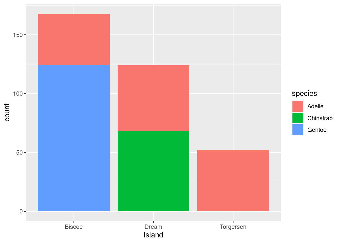
Great! We have a stacked bar chart that shows the species by island! But the researchers have asked us to make it look “nicer” - things like better labels, colors, etc.
Back to the drawing board…let’s start with labels! We want to add a title and make the axis labels be capitalized vs lower-case. Also someone complained about the background color and asked us to make it look “cleaner”.
Cleaning up
Add a title, x-axis and y-axis labels, and change the theme, below are some possible options for you to choose from:
theme_greytheme_bwtheme_darktheme_minimaltheme_void
ggplot(data = penguins, aes(x = island, fill = species)) + geom_bar() + labs() + # Use help if you want to learn more about what goes inside! theme_xxx() #pick one of the themes above!
ggplot(data = penguins, aes(x = island, fill = species)) +
  geom_bar() +
  labs(title = "Distribution of penguin species by island",
       x = "Island",
       y = "Number of penguins observed") +
  theme_bw()
Okay - whew! We added a title, a nice x-axis and y-axis label, changed the theme to theme_bw which we think looks pretty clean so hopefully they do too.
Now we just need to tackle color. Hmmmm…we know it’s a bar chart which means that we need to specify ‘fill’ vs ‘color’, so we can use the function scale_fill_brewer to pick out our favorite RColorBrewer palette for this graph. We want a qualitative one and we also want one that is colorblind friendly, so let’s pick palette 3, but if you have a different favorite you should use that one!
Color time
Change the fill colors for the bar-chart using RColorBrewer palettes.
ggplot(data = penguins, aes(x = island, fill = species)) +
  geom_bar() +
  scale_fill_brewer() + #this is new! What arguments should be used?
  labs(title = "Distribution of penguin species by island",
       x = "Island",
       y = "Number of penguins observed") +
  theme_bw()
ggplot(data = penguins, aes(x = island, fill = species)) +
  geom_bar() +
  scale_fill_brewer(type = "qual", palette = 3) +
  labs(title = "Distribution of penguin species by island",
       x = "Island",
       y = "Number of penguins observed") +
  theme_bw()
Annnnd of course one of the researchers had a last minute request. They didn’t like the stacked bar chart and they wanted to know if we could make them side-by-side instead. As an extra challenge see if you can figure out how to make each bar the same width as well!
Changing positions
Change the bar-chart from a stacked bar-chart to a side-by-side bar-chart by changing the position argument
# Try typing "position_" and then wait a second, a menu of options should appear

ggplot(data = penguins, aes(x = island, fill = species)) +
  geom_bar(position = position_xxxx()) +
  scale_fill_brewer(type = "qual", palette = 3) +
  labs(title = "Distribution of penguin species by island",
       x = "Island",
       y = "Number of penguins observed") +
  theme_bw()
ggplot(data = penguins, aes(x = island, fill = species)) +
  geom_bar(position = position_dodge(preserve = "single")) +
  scale_fill_brewer(type = "qual", palette = 3) +
  labs(title = "Distribution of penguin species by island",
       x = "Island",
       y = "Number of penguins observed") +
  theme_bw()
TA-DAAaaaaa!!! I think we all deserve some cookies after that don’t you? Wait…there’s more? Okay, cookies will have to wait, let’s get cracking!
Which species has the longest bill?
ggplot(data = penguins, aes(x = bill_length_mm))+
  geom_histogram(aes(fill = species),
                     alpha = 0.5,
                     position = 'identity') + # Need to have position = 'identity' to have the alpha work!
  scale_fill_brewer(type = 'qual', palette = 3) +
  labs(title = "Distribution of bill length (mm) by species",
       x = "Bill Length (mm)",
       y = "Number of Penguins observed") +
  theme_bw()
## Warning: Removed 2 rows containing non-finite outside the scale range
## (`stat_bin()`).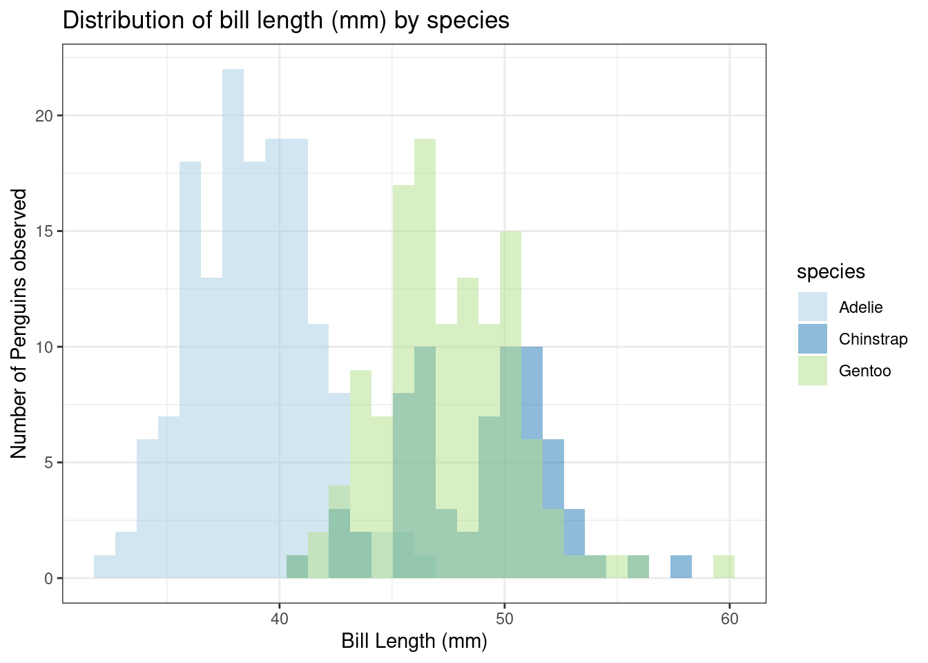
Looks like Gentoo and Chinstrap are pretty much tied for longest bill! Wonder if bill length is related to other measurements…Always more questions!
Which measurements are related to each other?
##                   bill_length_mm bill_depth_mm flipper_length_mm body_mass_g
## bill_length_mm                 1            NA                NA          NA
## bill_depth_mm                 NA             1                NA          NA
## flipper_length_mm             NA            NA                 1          NA
## body_mass_g                   NA            NA                NA           1
Why are we getting NAs? Is it because of the missing values? Okay fine, let’s only use complete observations.
##                   bill_length_mm bill_depth_mm flipper_length_mm body_mass_g
## bill_length_mm         1.0000000    -0.2350529         0.6561813   0.5951098
## bill_depth_mm         -0.2350529     1.0000000        -0.5838512  -0.4719156
## flipper_length_mm      0.6561813    -0.5838512         1.0000000   0.8712018
## body_mass_g            0.5951098    -0.4719156         0.8712018   1.0000000
Excellent! So body mass and flipper length are VERY correlated and flipper length and bill length and depth also seem to be related. Honestly a lot of these seem related, so let’s go for the MOST correlated pair. *And remember to include species in the aes() to show the correlations for specific species.
ggplot(data = penguins, aes(x = body_mass_g, y = flipper_length_mm)) +
  geom_point(aes(color = species,
                 shape = species))+
  scale_color_brewer(type = 'qual', palette = 3) +
  labs(title = "Relationship of body mass and flipper length by species",
       x = "Body Mass (g)",
       y = "Flipper Length (mm)") +
  theme_bw()
## Warning: Removed 2 rows containing missing values or values outside the scale range
## (`geom_point()`).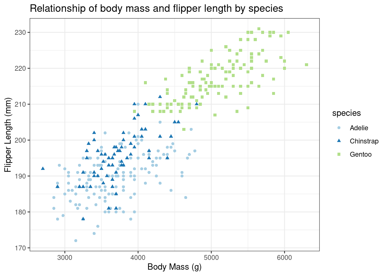
Fascinating… the Gentoo are really all in a class by themselves. Otherwise it looks like the overall relationship between body mass and flipper length is the same among the different penguin species. You can add a trend-line to the graph using geom_smooth to see that easier or see if the human eye is being tricked by very fun looking dots.
ggplot(data = penguins,
       aes(x = body_mass_g, y = flipper_length_mm)) +
  geom_point(aes(color = species,
             shape = species))+
  geom_smooth(method = 'lm', se = FALSE, aes(color = species)) +
  scale_color_brewer(type = 'qual', palette = 3) +
  labs(title = "Relationship of body mass and flipper length by species",
       x = "Body Mass (g)",
       y = "Flipper Length (mm)") +
  theme_bw()
## Warning: Removed 2 rows containing non-finite outside the scale range
## (`stat_smooth()`).## Warning: Removed 2 rows containing missing values or values outside the scale range
## (`geom_point()`).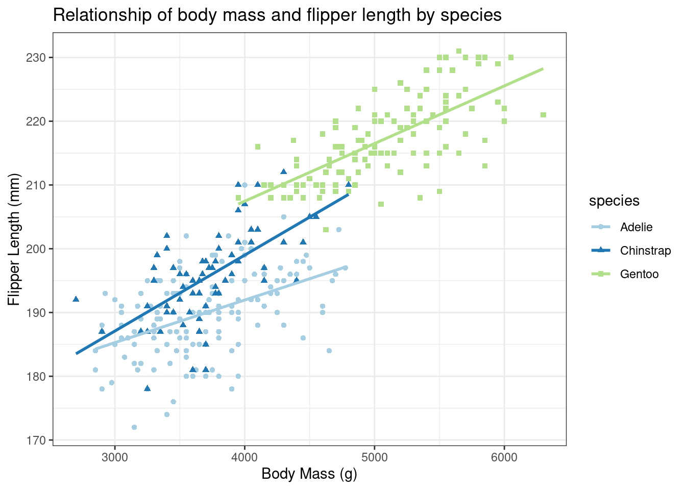
Let’s try doing the same exercise, but let’s use the facet_wrap function.
ggplot(data = penguins,
       aes(x = body_mass_g, y = flipper_length_mm)) +
  geom_point(aes(color = species,
             shape = species)) +
  geom_smooth(method = 'lm', se = FALSE, aes(color = species)) +
  scale_color_brewer(type = 'qual', palette = 3) +
  labs(title = "Relationship of body mass and flipper length by species",
       x = "Body Mass (g)",
       y = "Flipper Length (mm)") +
  theme_bw() +
  facet_wrap(facets = ~species)
## Warning: Removed 2 rows containing non-finite outside the scale range
## (`stat_smooth()`).## Warning: Removed 2 rows containing missing values or values outside the scale range
## (`geom_point()`).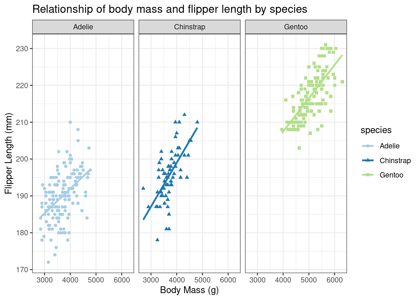
What’s the danger in using the scales = 'free' argument? What happens when you add it? How would you explain the result to someone else?
As we’ve said before…always more questions!
Try to think of your own question that you use this data to answer or go back to the correlation matrix and see if there’s other relationships you’d like to explore!
The researchers have one more thing they’d like to say…
THANK YOU!