Before you start…
Make sure you are still in your project that you created for doing exercises and then make a new R script. Save it as soon as you make it and give it a good name like exercise_2_day_3.R or herriot.R and you’ll be ready to go!
Always more you can do
Because of our excellent work so far both as an analytic bot and as the head baker, we’ve been gifted the wonderful R Graphics Cookbook: Practical Recipes for Visualing Data.
Wow, there’s a bunch of cool stuff in here, in fact, there’s a bunch of cool stuff that could make the work that we’ve already done even better.
Instead of using penguins, we’re going to be using penguins_raw for this exercise and we’re going to be making some graphs on summarized data. But first, let’s take a look at that data!
library(tidyverse)
library(palmerpenguins)

penguins_raw <- penguins_raw # this loads data from the palmerpenguins package

glimpse(penguins_raw)
## Rows: 344
## Columns: 17
## $ studyName <chr> "PAL0708", "PAL0708", "PAL0708", "PAL0708", "PAL…
## $ `Sample Number` <dbl> 1, 2, 3, 4, 5, 6, 7, 8, 9, 10, 11, 12, 13, 14, 1…
## $ Species <chr> "Adelie Penguin (Pygoscelis adeliae)", "Adelie P…
## $ Region <chr> "Anvers", "Anvers", "Anvers", "Anvers", "Anvers"…
## $ Island <chr> "Torgersen", "Torgersen", "Torgersen", "Torgerse…
## $ Stage <chr> "Adult, 1 Egg Stage", "Adult, 1 Egg Stage", "Adu…
## $ `Individual ID` <chr> "N1A1", "N1A2", "N2A1", "N2A2", "N3A1", "N3A2", …
## $ `Clutch Completion` <chr> "Yes", "Yes", "Yes", "Yes", "Yes", "Yes", "No", …
## $ `Date Egg` <date> 2007-11-11, 2007-11-11, 2007-11-16, 2007-11-16,…
## $ `Culmen Length (mm)` <dbl> 39.1, 39.5, 40.3, NA, 36.7, 39.3, 38.9, 39.2, 34…
## $ `Culmen Depth (mm)` <dbl> 18.7, 17.4, 18.0, NA, 19.3, 20.6, 17.8, 19.6, 18…
## $ `Flipper Length (mm)` <dbl> 181, 186, 195, NA, 193, 190, 181, 195, 193, 190,…
## $ `Body Mass (g)` <dbl> 3750, 3800, 3250, NA, 3450, 3650, 3625, 4675, 34…
## $ Sex <chr> "MALE", "FEMALE", "FEMALE", NA, "FEMALE", "MALE"…
## $ `Delta 15 N (o/oo)` <dbl> NA, 8.94956, 8.36821, NA, 8.76651, 8.66496, 9.18…
## $ `Delta 13 C (o/oo)` <dbl> NA, -24.69454, -25.33302, NA, -25.32426, -25.298…
## $ Comments <chr> "Not enough blood for isotopes.", NA, NA, "Adult…If we want to do anything else with this data, it might be a good idea to clean the names because some of these look like they would be annoying to type…Delta 15 N (o/oo)? No thank you.
Good news! There’s a package that’s made just for cleaning up things and it’s called janitor and it’s incredibly useful, just like real-life janitors!
It can help clean your column names, find duplicate rows, and even make spiffy tables.
install.packages("janitor") # Comment this line out if you already installed this package

library(janitor) # It's good practice to load libraries at the top of your script, so go ahead and move this up with the rest of your library calls.

penguins_raw_clean <- clean_names(penguins_raw)

names(penguins_raw_clean)
## [1] "study_name" "sample_number" "species"
## [4] "region" "island" "stage"
## [7] "individual_id" "clutch_completion" "date_egg"
## [10] "culmen_length_mm" "culmen_depth_mm" "flipper_length_mm"
## [13] "body_mass_g" "sex" "delta_15_n_o_oo"
## [16] "delta_13_c_o_oo" "comments"Still long, but the names are so much better!
Distribution of species by island revisted
Well, let’s see what we can do to make this more exciting. Let’s create a summary table in additional to making a new and exciting visual.
We’ll be using the tidyverse pipe %>% that we showed last session - it makes our code easier to read and reduces the number of nested parenthesis we have to deal with.
penguin_island_dist <- penguins_raw_clean %>%
  group_by(region, island, species) %>%
  summarise(count = n())

penguin_island_dist
## # A tibble: 5 × 4
## # Groups: region, island [3]
## region island species count
## <chr> <chr> <chr> <int>
## 1 Anvers Biscoe Adelie Penguin (Pygoscelis adeliae) 44
## 2 Anvers Biscoe Gentoo penguin (Pygoscelis papua) 124
## 3 Anvers Dream Adelie Penguin (Pygoscelis adeliae) 56
## 4 Anvers Dream Chinstrap penguin (Pygoscelis antarctica) 68
## 5 Anvers Torgersen Adelie Penguin (Pygoscelis adeliae) 52That’s okay looking, but let’s try the tabyl function from the janitor package as well. The benefits of the tabyl function are that you can use the adorn_ functions from janitor to do things like add row and column totals really easily. This makes summary tables like the one below a breeze!
tabyl(penguins_raw_clean, species, island) %>%
  adorn_totals(where = 'row') %>%
  adorn_totals(where = 'col')
## species Biscoe Dream Torgersen Total
## Adelie Penguin (Pygoscelis adeliae) 44 56 52 152
## Chinstrap penguin (Pygoscelis antarctica) 0 68 0 68
## Gentoo penguin (Pygoscelis papua) 124 0 0 124
## Total 168 124 52 344Nice! A quick way to generate a two-by-two table that we could include in a report. Now we just need a pretty chart to go with it.
Graphing summary data
So below is a recreation of our previous chart using the raw data. What would we need to change to make this chart using the summarized data we stored in penguin_island_dist?
Remember that helpful tip from the help of geom_bar?
“There are two types of bar charts: geom_bar() and geom_col(). geom_bar() makes the height of the bar proportional to the number of cases in each group (or if the weight aesthetic is supplied, the sum of the weights). If you want the heights of the bars to represent values in the data, use geom_col() instead.”
—
help(geom_bar)
Column charts
Recreate your previous bar-chart using the summarized data that you stored in penguin_island_dist.
ggplot(data = __________,
       aes(x = ______, y = ______, fill = ________)) +
  geom_xxx(position = position_dodge(preserve = "single")) +
  scale_fill_brewer(type = "qual", palette = 3) +
  labs(title = "Distribution of penguin species by island",
       x = "Island",
       y = "Number of penguins observed") +
  theme_bw()
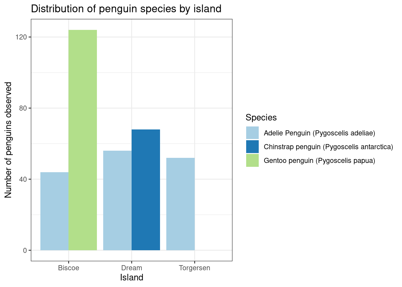
ggplot(data = penguin_island_dist,
       aes(x = island, y = count, fill = species)) +
  geom_col(position = position_dodge(preserve = "single")) +
  scale_fill_brewer(type = "qual", palette = 3) +
  labs(title = "Distribution of penguin species by island",
       x = "Island",
       y = "Number of penguins observed") +
  theme_bw()
Adding labels
Something special about summarized data is that now we can add labels to our columns as well. We can do this using geom_text but there’s a couple of things that we need to know before we get started.
- You can’t nudge and dodge text, so instead adjust the y position
ggplot2doesn’t know you want to give the labels the same virtual width as the bars so you have to make your position width smaller.geom_text()adds only text to the plot.geom_label()draws a rectangle behind the text, making it easier to read.- To add labels at specified points use
annotate()withannotate(geom = "text", ...)orannotate(geom = "label", ...) geom_text()requires the following aesthetics (i.e. pass these to theaesfunction if you haven’t yet!): x, y, and label (this is probably the one you’ll need to add)
Bar labels
Add text labels to your columns of the total count of each species per island. You might need to position them higher than the top of the bar and you shrink the width to make them look nice, do not be afraid to experiment.
ggplot(data = penguin_island_dist,
       aes(x = island, y = count, fill = species)) +
  geom_col(position = position_dodge2(preserve = "single")) +
  geom_xxxx(aes(label = ______, y = _____ + 5),
            position = position_dodge2(width = ______)) +
  scale_fill_brewer(type = "qual", palette = 3) +
  labs(title = "Distribution of penguin species by island",
       x = "Island",
       y = "Number of penguins observed") +
  theme_bw()
ggplot(data = penguin_island_dist,
       aes(x = island, y = count, fill = species)) +
  geom_col(position = position_dodge2(preserve = "single")) +
  geom_text(aes(label = count, y = count + 5),
            position = position_dodge2(width = 0.9)) +
  scale_fill_brewer(type = "qual", palette = 3) +
  labs(title = "Distribution of penguin species by island",
       x = "Island",
       y = "Number of penguins observed") +
  theme_bw()
We had to do three things when using geom_text or geom_label - try both and see which one you like the best!
- Make sure the positions matched, so if your
geom_is usingdodge2, yourgeom_textshould be usingdodge2. - Increase the
yvalue by some amount so that the label will sit higher than the top of the labeled bar. - For bar/column charts, decrease the width so they sit nicer on top.
Pick your challenge!
Now that you have some experience under your belt, it’s important to shake things up and have some fun. Depending on how much time you have left, pick 1 or several of the challenges below and see what you can make!
The links below will take you to the specific section of the R Graphics Cookbook that will answer the question of how you do the thing.
- Save a graphic as a .png (and don’t cheat using the export feature in RStudio!)
- Put the islands in a different order on the x-axis!
- Make the legend labels easier to read (they’re a little long…)
- Use any theme from the package ThemePark
- You’ll have install two packages before you can use:
remotesand thenThemePark install.packages("remotes")remotes::install_github("MatthewBJane/ThemePark")
- You’ll have install two packages before you can use:
- Try to add MN State brand colors using the home-grown package
mncolorsinstall.packages("remotes")remotes::install_github("tidy-MN/mncolors")
- Change the font