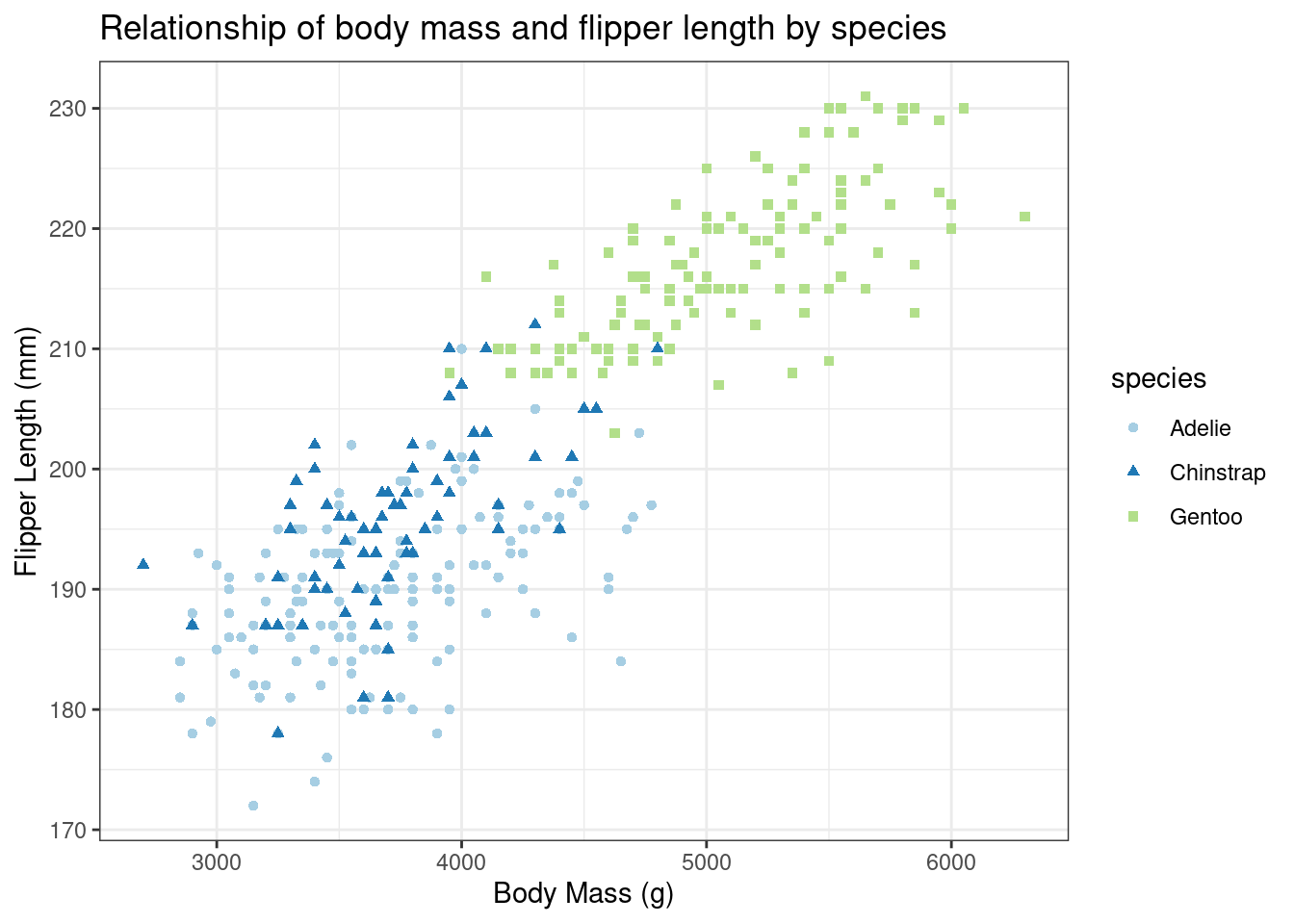
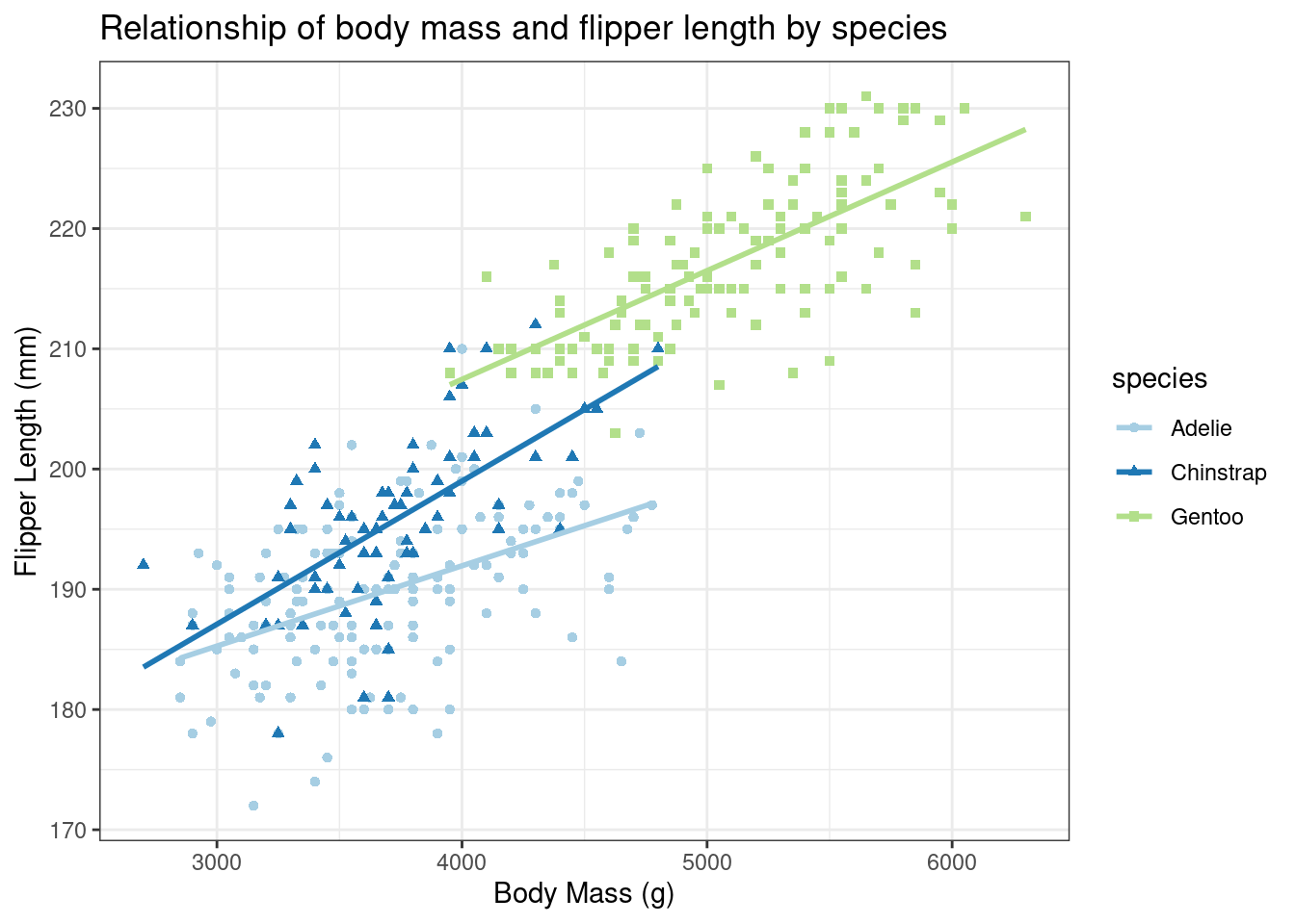
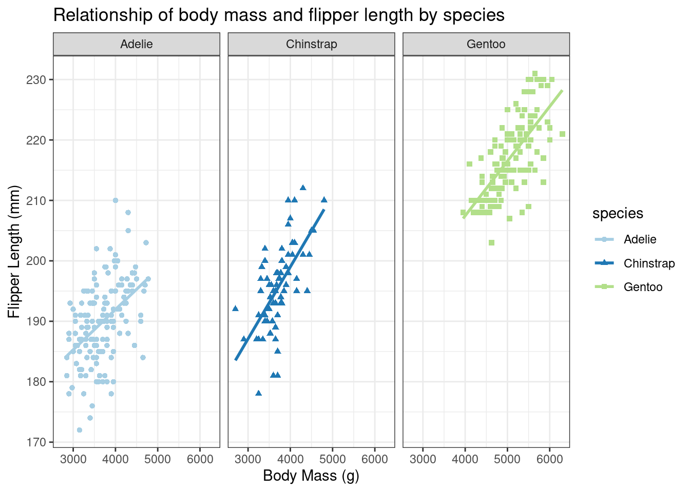
Palmer Penguin Exploration - Part 1
We met some very excited researchers who wanted to share their data with us when they heard we really liked penguins. They also were hoping that maybe we would look at their data and help them answer some questions about it. What do you say? Are you willing to help?
THANK YOU! Here’s the questions the researchers were hoping to have answered -
- How can we determine the distribution of species by island?
- Which species has the longest bill?
- What measurements are related to each other? For example is a penguin with a long bill more likely to have a larger body mass? Also what relationship does species have to measurements?
Let’s make a graphical analysis of the data for them!
library(tidyverse)
# install.packages('palmerpenguins') #you might not have this package yet so make sure you install it!
library(palmerpenguins)

data("penguins") #this will read in the data from the package and load it to to our environment
What does the data look like?
As good scientists we should always start with looking at the data provided to us and understanding what information was collected. What are some options for just taking a quick peek at the data?
## Rows: 344
## Columns: 8
## $ species           <fct> Adelie, Adelie, Adelie, Adelie, Adelie, Adelie, Adel…
## $ island            <fct> Torgersen, Torgersen, Torgersen, Torgersen, Torgerse…
## $ bill_length_mm    <dbl> 39.1, 39.5, 40.3, NA, 36.7, 39.3, 38.9, 39.2, 34.1, …
## $ bill_depth_mm     <dbl> 18.7, 17.4, 18.0, NA, 19.3, 20.6, 17.8, 19.6, 18.1, …
## $ flipper_length_mm <int> 181, 186, 195, NA, 193, 190, 181, 195, 193, 190, 186…
## $ body_mass_g       <int> 3750, 3800, 3250, NA, 3450, 3650, 3625, 4675, 3475, …
## $ sex               <fct> male, female, female, NA, female, male, female, male…
## $ year <int> 2007, 2007, 2007, 2007, 2007, 2007, 2007, 2007, 2007…## species island bill_length_mm bill_depth_mm
## Adelie :152 Biscoe :168 Min. :32.10 Min. :13.10
## Chinstrap: 68 Dream :124 1st Qu.:39.23 1st Qu.:15.60
## Gentoo :124 Torgersen: 52 Median :44.45 Median :17.30
## Mean :43.92 Mean :17.15
## 3rd Qu.:48.50 3rd Qu.:18.70
## Max. :59.60 Max. :21.50
## NA's :2 NA's :2
## flipper_length_mm body_mass_g sex year
## Min. :172.0 Min. :2700 female:165 Min. :2007
## 1st Qu.:190.0 1st Qu.:3550 male :168 1st Qu.:2007
## Median :197.0 Median :4050 NA's : 11 Median :2008
## Mean :200.9 Mean :4202 Mean :2008
## 3rd Qu.:213.0 3rd Qu.:4750 3rd Qu.:2009
## Max. :231.0 Max. :6300 Max. :2009
## NA's :2 NA's :2What do we know that we didn’t before after running these commands? We know that there are 8 columns, three of them are factors and the rest are numeric (either integer or double).
We also know that Chinstrap are the least prevalent and Biscoe Island has the most penguins. On a more unhappy note, we also see that there are missing data, some for the measurement data but most are for sex (11 NA’s).
Let’s go back to the researchers’ questions.
Species by Island
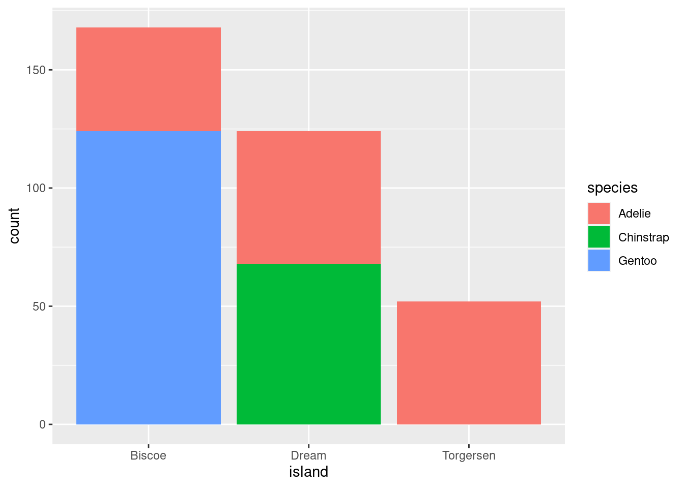
Great! We have a stacked bar chart that shows the species by island! But the researchers have asked us to make it look “nicer” - things like better labels, colors, etc.
Back to the drawing board…let’s start with labels! We want to add a title and make the axis labels be capitalized vs lower-case. Also someone complained about the background color and asked us to make it look “cleaner”.
ggplot(data = penguins, aes(x = island, fill = species)) +
geom_bar() +
labs(title = "Distribution of penguin species by island",
x = "Island",
y = "Number of Penguins observed") +
theme_bw()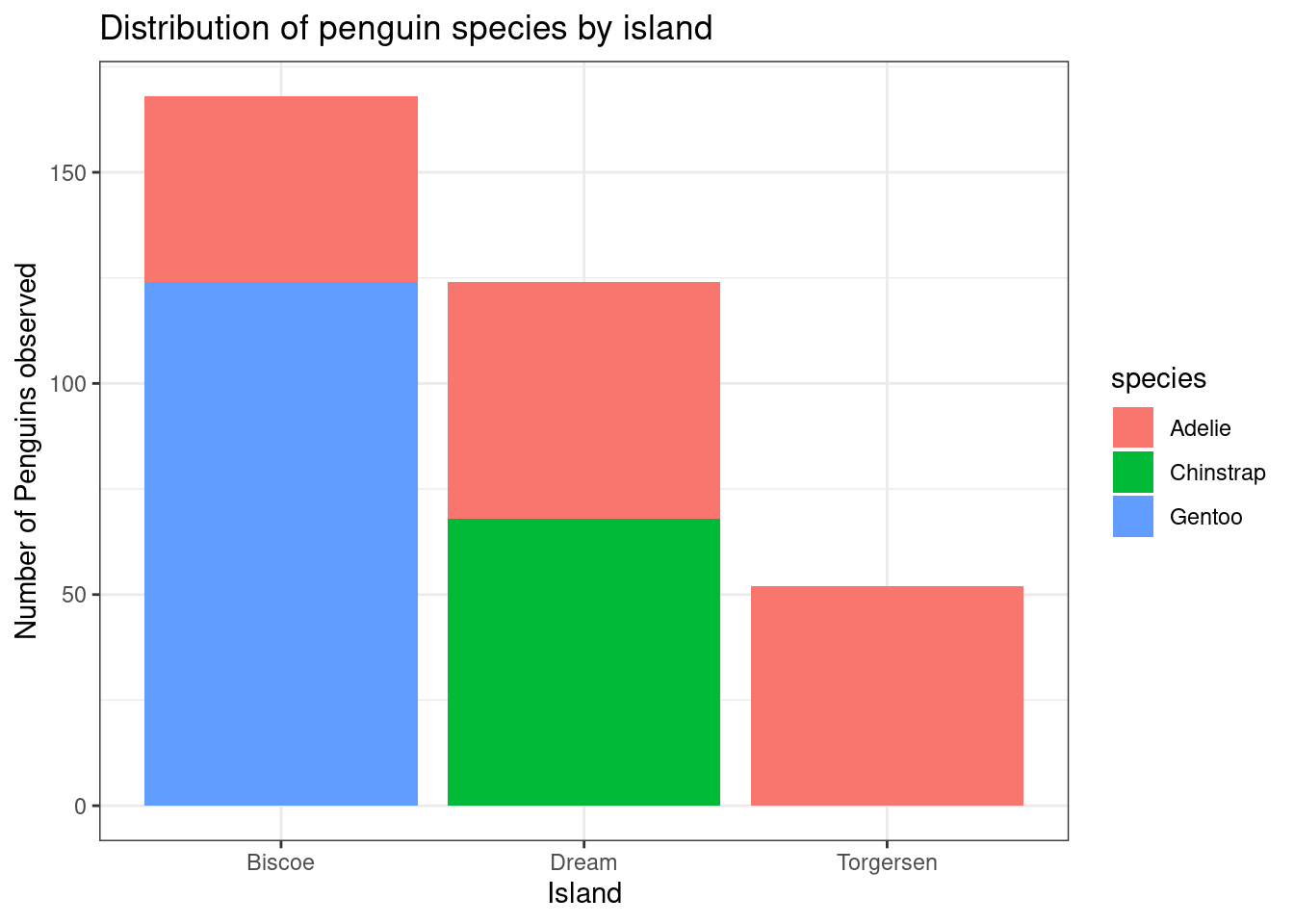
Okay - whew! We added a title, a nice x-axis and y-axis label, changed the theme to theme_bw which we think looks pretty clean so hopefully they do too.
Now we just need to tackle color…hmmm, we know it’s a bar-chart which means that we need to specify ‘fill’ vs ‘color’ so we can use the function scale_fill_brewer to pick out our favorite (RColorBrewer palette)[https://colorbrewer2.org/] for this graph. We want a qualitative one and we also want one that is colorblind safe so let’s pick palette 3!
ggplot(data = penguins, aes(x = island, fill = species)) +
  geom_bar() +
  scale_fill_brewer(type = 'qual', palette = 3) +
  labs(title = "Distribution of penguin species by island",
       x = "Island",
       y = "Number of Penguins observed") +
  theme_bw()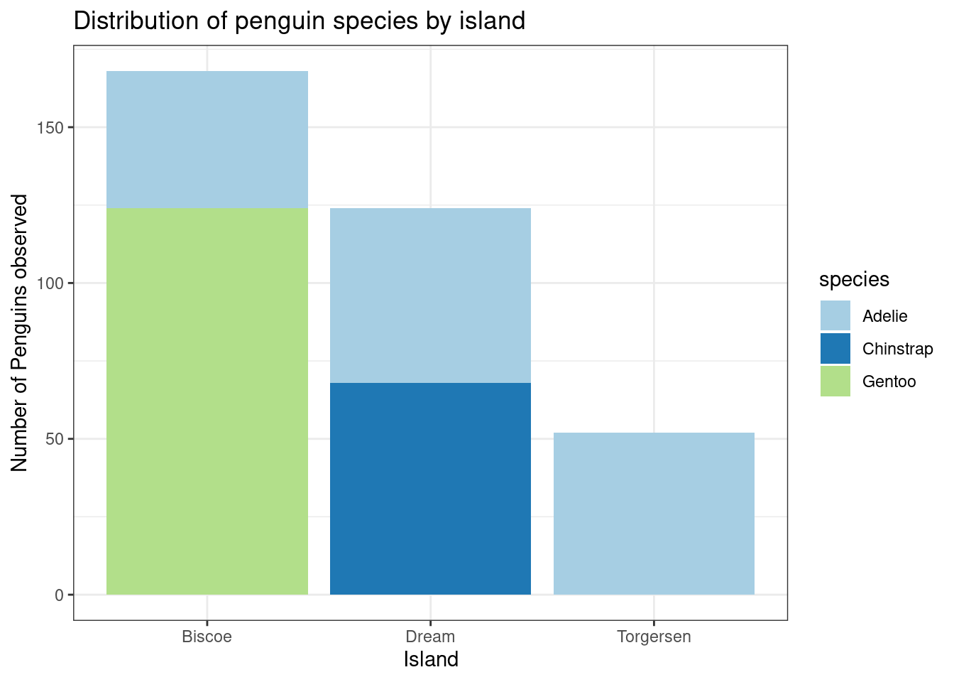
Annnnd of course one the researchers had a last minute request. They didn’t like the stacked bar chart and they wanted to know if we could make them side-by-side instead. As an extra challenge see if you can figure out how to make each bar the same width as well!
ggplot(data = penguins, aes(x = island, fill = species)) +
  geom_bar(position = position_dodge2(preserve = 'single')) +
  scale_fill_brewer(type = 'qual', palette = 3) +
  labs(title = "Distribution of penguin species by island",
       x = "Island",
       y = "Number of Penguins observed") +
  theme_bw()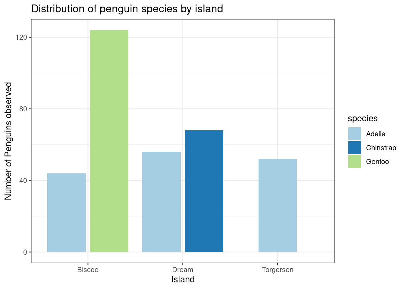
Which species has the longest bill?
ggplot(data = penguins, aes(x = bill_length_mm))+
  geom_histogram(aes(fill = species),
                     alpha = 0.5,
                     position = 'identity') + # need to have position = 'identity' to have the alpha work!
  scale_fill_brewer(type = 'qual', palette = 3) +
  labs(title = "Distribution of bill length (mm) by species",
       x = "Bill Length (mm)",
       y = "Number of Penguins observed") +
  theme_bw()
## `stat_bin()` using `bins = 30`. Pick better value with `binwidth`.## Warning: Removed 2 rows containing non-finite values (stat_bin).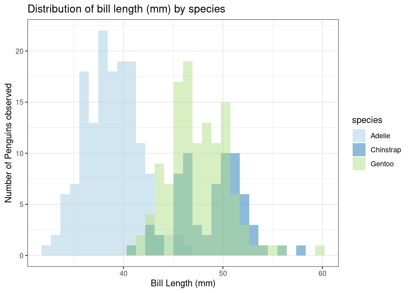
Looks like Gentoo and Chinstrap are pretty much tied for longest bill! Wonder if bill length is related to other measurements…Always more questions!
